Concept / App design
Client
Kivra — www.kivra.se
When
Spring/summer 2012
Description
Kivra is a brand new and exciting company led by Robert Wahlström, Stefan Krook and Ludvig Linge - three heavyweights in Swedish telecom and web services. Kivra is a service that aims to eliminate regular postage and instead get companies and official institutions to send bills, offers and information digitally via Kivra instead of via regular post.
We were asked, in an early stage, to help Kivra to define the essentials their service. We did this by doing a user experience analysis of Kivra and help them to define the core usage of the service, when, where and how people would use it and to create a foundation on which the service could grow. We also created the embryo for their visual identity, language use and over all visual identity. This resulted in a presentation outlining what Kivra is and what Kivra isn’t service-wise, what the company’s core DNA is and how they should think about and communicate around their service. The presentation also included web interface mockups and function descriptions which has worked as a foundation for their continued work.
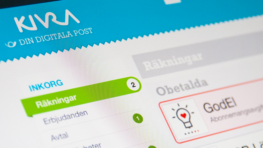
As a second step we were asked to create the design for Kivra’s mobile application. And application that lives somewhere between an email and a banking application. It needed to be simple, easy to get started with and friendly to use and at the same time handle large amounts of data from many different sources, tagged with various informations as well as feel secure and rigid.
Complex applications and large amounts of data is something we really like at Color Monkey and we loved to work on the project with Kivra and we hope the result shows.
